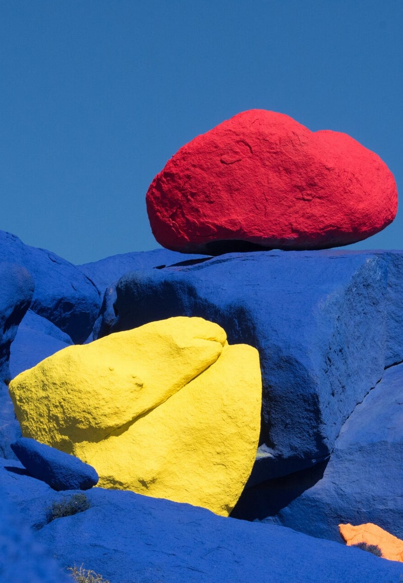
Many times, we have been mesmerised by the colours of a design without paying too much attention to its details or the actual layout.
Colours inspire emotions and actions, and that is a well-known ace in every designer’s (and actually every artist’s) sleeve.
How does a Kandinsky painting make you feel?
Why did Coca-Cola choose red as its main colour?
How do we feel about Apple’s white/silver/black colour palette?
As Pablo Picasso famously stated, "Colours, like features, follow the changes of emotions".
Even though there is a lack of extended research on how colours affect emotions, there are adequate, proven guidelines on how colours trigger certain feelings.
Even though hues and saturations may vary, let’s look at the primary colours.
RED
Red draws attention because of its long wavelength. It is associated with various heterogeneous feelings such as love, danger, passion, and strength. Red evokes dominance and confidence.
Red stimulates appetite and pushes people to have faster responses. For this reason, red is the dominant colour in many food companies, such as McDonald’s, Coca-Cola, KFC, Pizza Hut, and many more.
YELLOW
Another colour with mixed emotional connotations. Yellow is associated with happiness, positivity, and energy. However, at the same time, it can be perceived as a hue that warns and increases anxiety.
In the design world, yellow is more likely to be used carefully because of the high amount of light that is reflected.
Some of the companies that draw attention with yellow as their main colour are Post-it, Shell, and DHL.
BLUE
Last but certainly not least, blue brings a feeling of trust and loyalty. It is widely used because it creates a sense of calmness, wisdom, and relaxation. Blue is the colour that does not intrude and stands for patience and order. Hence, it is used by major banking and business companies such as American Express, Barclays, Facebook, Twitter, P&G, Pfizer, and many more.
These three primary colours can lead to endless different shades when we play with luminance and saturation. Each one of those shades evokes different emotions and has different meanings.
Experiment with the colour wheel, and you will be amazed by the results.
